SuperBowl LX saw the Seattle Seahawks defeat the New England Patriots. But, for those of us working in marketing, the real competition unfolded in the adbreaks.

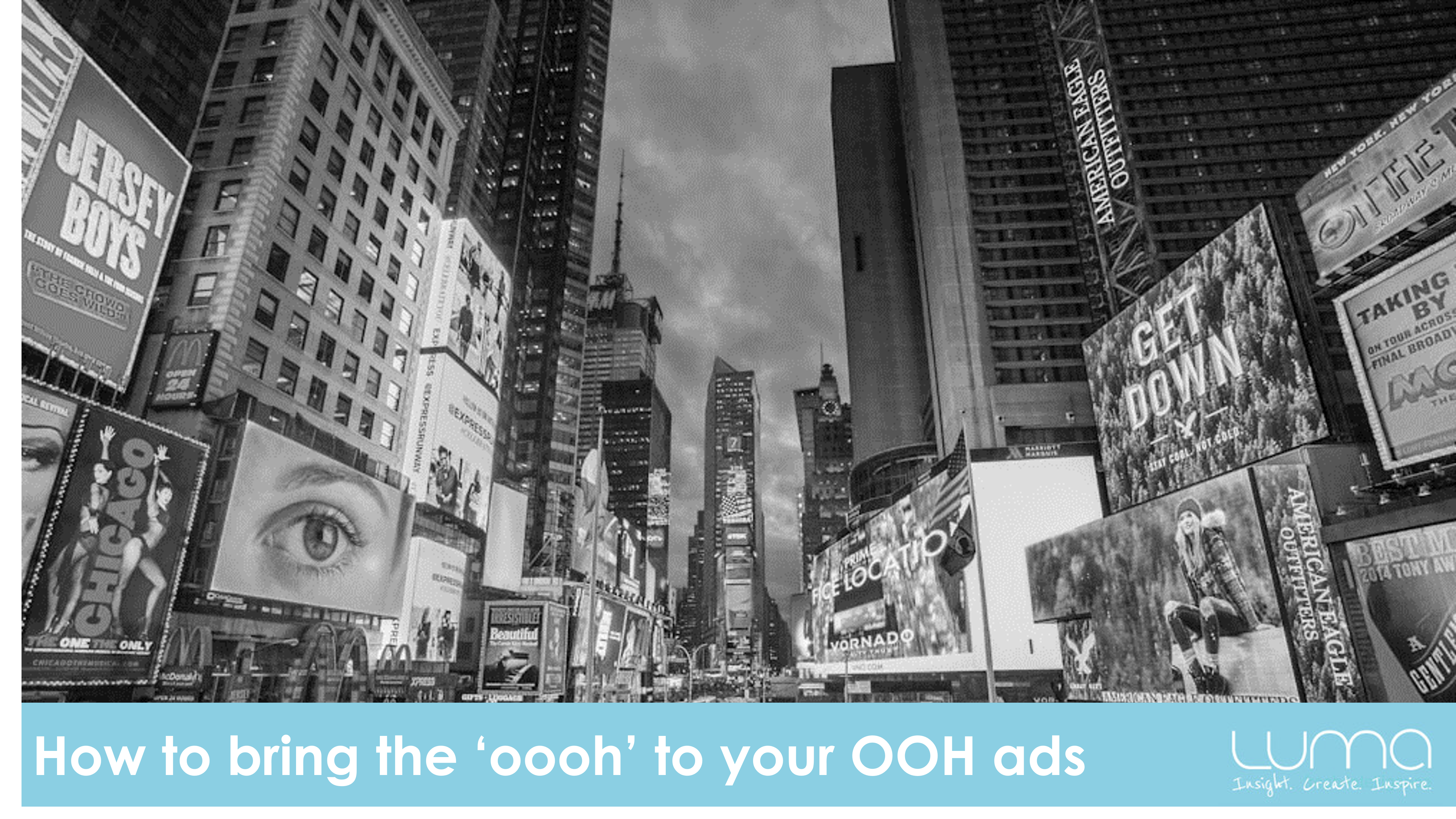
Out of home (OOH) advertising (like posters, transit ads, shopperlites and billboards) is one of the oldest forms of advertising. So, in this modern, hi-tech world, it is interesting to see the continued uplift in spend for this channel. In the US, OOH spend grew by 2.1% in 2023, and in Australia, spend on OOH ads is forecasted to reach almost $1bn by 2024 - with most of this growth coming from digital OOH.
Anecdotally, at Luma, we are also seeing an increase in clients including OOH within their media mix. The growth seems to be borne out of necessity, as OOH provides a way to build campaign reach in a relatively cost-effective way.
With lower budgets there has also been an increased focus on the effectiveness of OOH ads. Once, all the focus was put on the TVC and very little energy was given to OOH ads. Now, more clients are carefully evaluating all the components of their OOH ads to ensure they achieve strong ROI.
We have evaluated 100s of OOH ads - so, what makes a great OOH ad?
Here are 5 tips to help you get it right…
1. Keep it Simple:
You have to remember that when people are seeing your OOH ads they are often on the move – either driving, walking or travelling on public transport – and sometimes they are seeing it from a distance. Your audience will only have around 3-5 seconds to see your ad - often even less!
So, your ad needs to convey your feeling and message instantly.
Don’t be tempted to jam a whole lot of messages or ideas in your ad. It sounds obvious, but we often see ads that have a headline, message and tagline….along with a visual and logo. There is no way viewers are going to read and process all of that content.
Pick just one idea based on your campaign message or linked to the category drivers. Remember this quote from David Oligvy “Consumers don’t buy products. They buy product benefits” so focus on how you want people to feel.

2. Put important elements at the top left
It might sound obvious but most languages, including English, are read from left to right.

So, when there is text on ads, your viewers will instinctively look to the top left corner. This means that anything in the bottom right corner will get read last. And when you only have a few seconds, it is likely that anything in the bottom left corner will get missed…including your brand logo. Eye tracking studies have proven this to be true.
Think about how you can prioritise the use of your space and message placement using the guide above. Use space at the top left of your ad for what is most important – like your logo or message.
While Left to Right is the most common reading direction globally, other languages are read Right to Left or Top to bottom so it definitely something to check when you are designing your global campaigns.

3. Use strong visuals and text
Remember that your ad is just more clutter in the eyes of your viewers. So, you need to be bold to help your ad stand out and get noticed.
Be sure that any text is clear and large enough to read from a distance.
And use visuals that are pleasing on the eye that the viewer will want to look at. And ideally, the image should also convey something about you….do a test and cover of the text and see what your image conveys if people just saw that and your logo. Hopefully it will convey the mood or feeling your are aiming for. If not, start again.


4. Have fun with the format and location
To help your ad get noticed and also build a positive feeling, think about your creative and the locations you are using. If there is a way of linking the ad to the outside environment or your location do it. It will be worth the effort and cost as your ad will be talked about and shared in a way that will help link your reach and your ROI.


5. Focus on your brand codes
Above all else – take the opportunity to reinforce your brand code. Use colour, tone and style to get your brand out there. Even if you don’t have any message, choose an image or line that conveys a feeling or perception of you as a brand.
Remember It is not what you say but how you make people feel!


From the blog


